
Cuesta College Collateral Branding
When I joined the Marketing and Communications department at Cuesta College, its print collateral lacked a unified style. I worked to establish and standardize a brand voice, ensuring all communication materials have cohesive messaging and a consistent look and feel. One of the marketing campaigns contributed to a 15% increase in enrollment over a single semester.
As the lead graphic design staff on the campus of approximately 13,000 students, my responsibility stretched from a small handout for the Student Health Center and a booklet for Student Services to Instagram graphics, magazine ads, and OOH billboards.

Inspired by the Faces of New York book, we began posting black and white portraits of students, faculty, and staff, along with brief bios, on Instagram. Eventually, we decided to continue with this style for Outreach items, such as enrollment postcards and billboards. The goal is to give us a sophisticated look to convey the quality education and support we offer at Cuesta College, as well as to feature the real people on campus.
This campaign increased enrollment by 15% in the following semester.

This is another billboard in the new look. The simple graphic with large typography stood out from other busy billboards.

An example of a social post. This was for the election day—I tried to make it look calm.
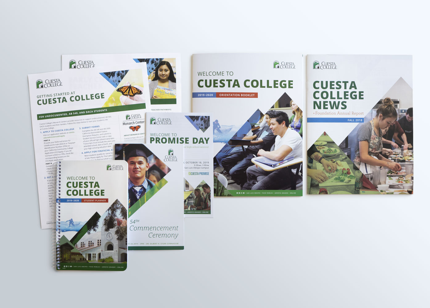
These were the initial attempts to give the College collateral a consistent brand look and feel. After seeing this campaign throughout the campus, faculty and staff came on board with the understanding that it was essential to have a cohesive visual.

The Harold J. Miossi Art Gallery at Cuesta College used to have a completely independent look and feel. Still, I tried to incorporate the general “Cuesta-look” to tie the entity with the College visually. This piece received the third-place award from the Community College Public Relations Organization (CCPRO).

A few examples of the Art Gallery event posters. The gallery requested that each poster/postcard design be unique to the show, reflecting the featured artist’s work.

A few examples of the Performing Arts Center event posters. Similar to the Art Gallery, the Performing Arts Center requested that each event have a different look. I gave the bi-annual events an individualized look while incorporating some recurring design elements to maintain the visual cue to the College.

The Community Programs at Cuesta College are financially independent of the College, and the challenge was to give them a unique look and feel that isn’t too far removed from the overall Cuesta branding. I use the College’s secondary brand typeface to make the connection with the general “Cuesta-look.” These are distributed to about 31,000 households, mainly in San Luis Obispo County.